All Naturally Good
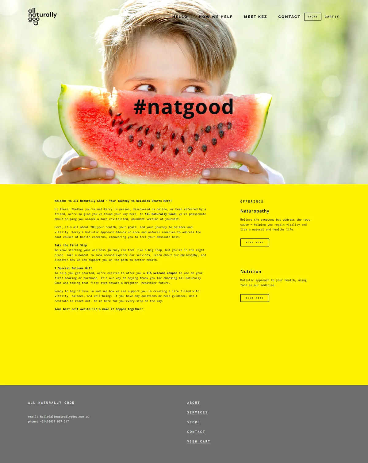
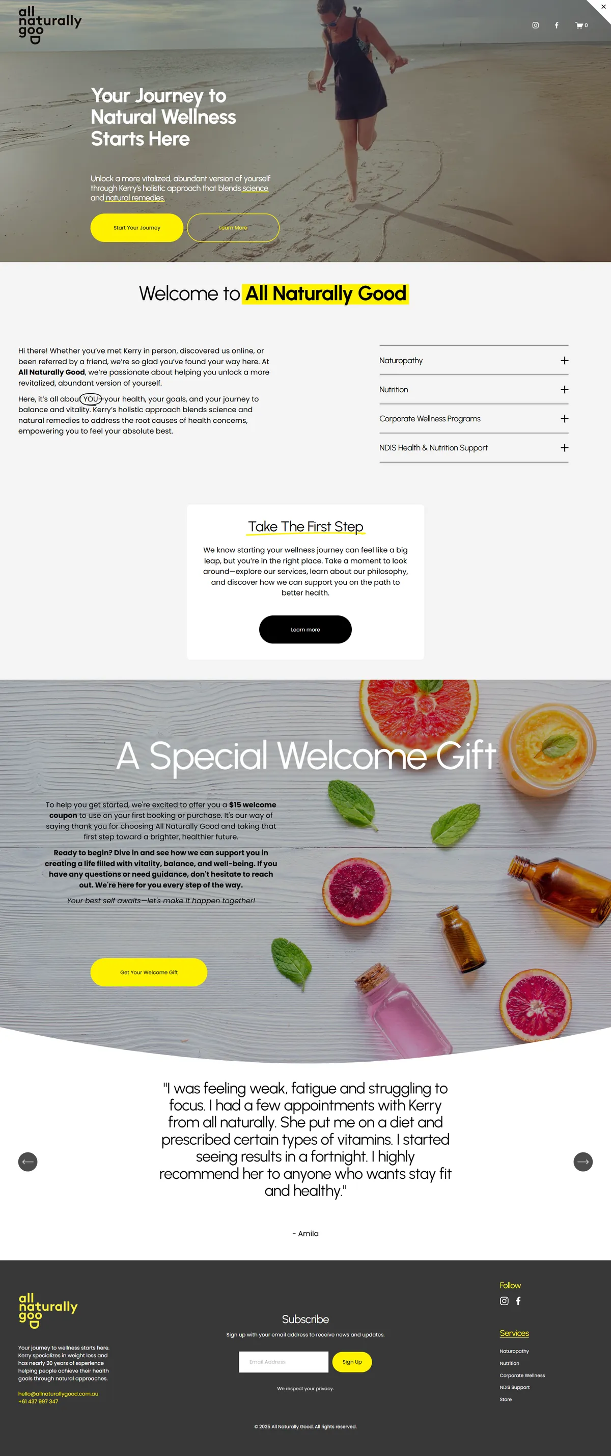
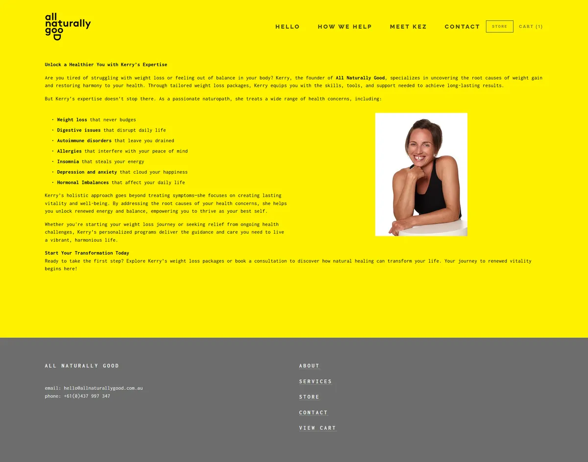
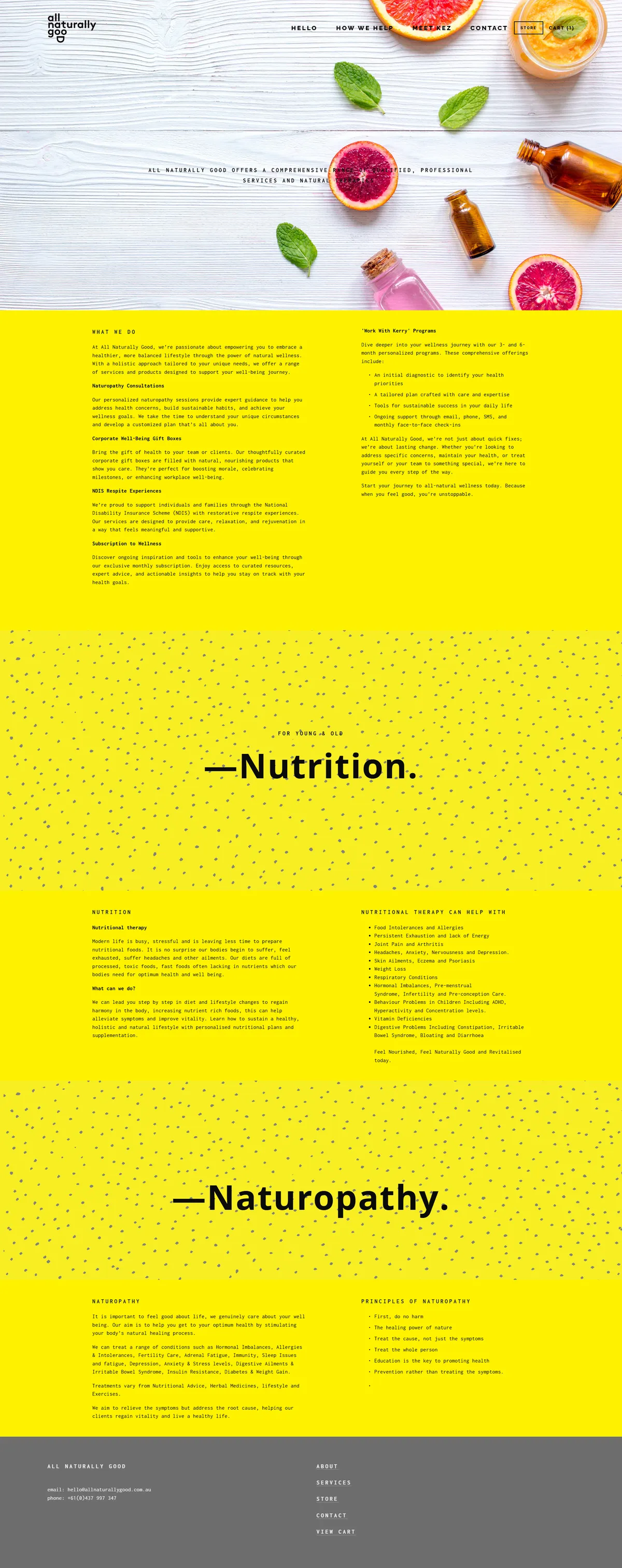
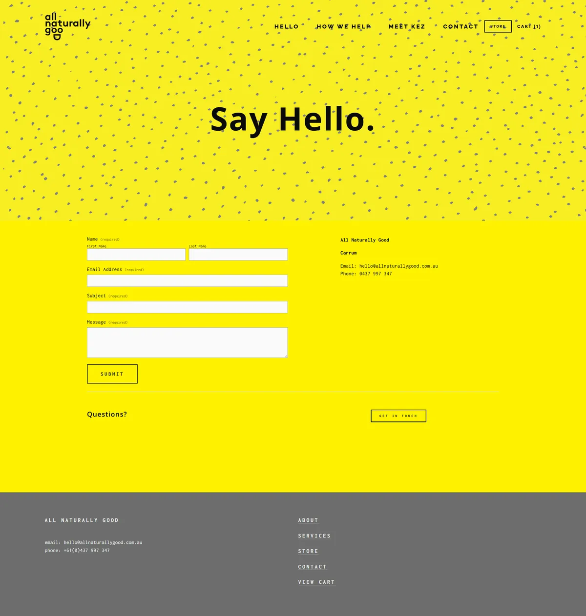
Health & Natural ProductsKerry, owner and practitioner at All Naturally Good had a Squarespace site they'd built themselves years back. It was a great first site and served her well, but the blocky yellow colour was overwhelming and the site was text heavy.
A fresh start for a great brand.Kerry is taking a break from the business right now, so the live site is paused. The redesign work below tells the story.
The Brief
All Naturally Good wanted:
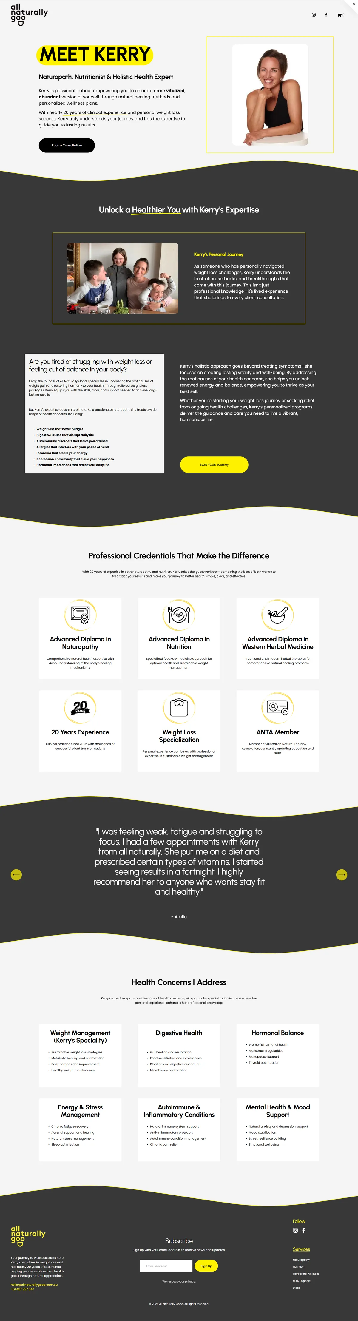
- A website that captured Kerry's infectious, happy personality
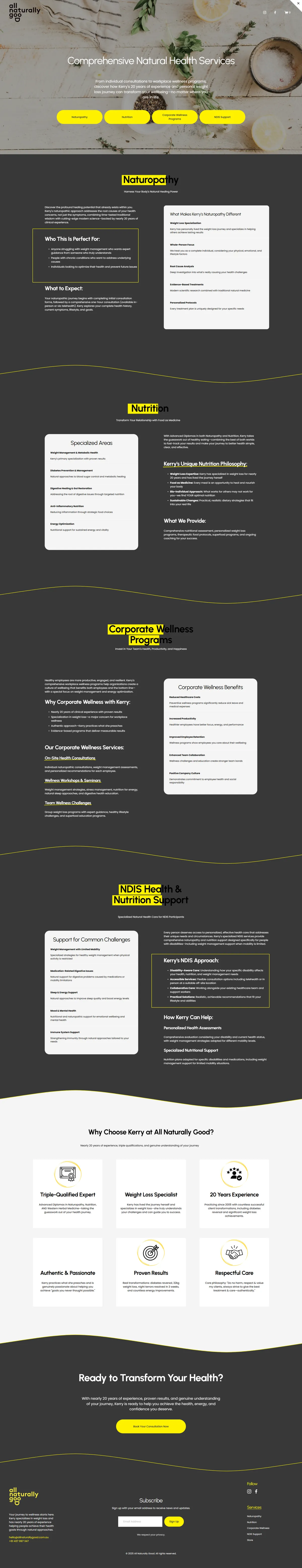
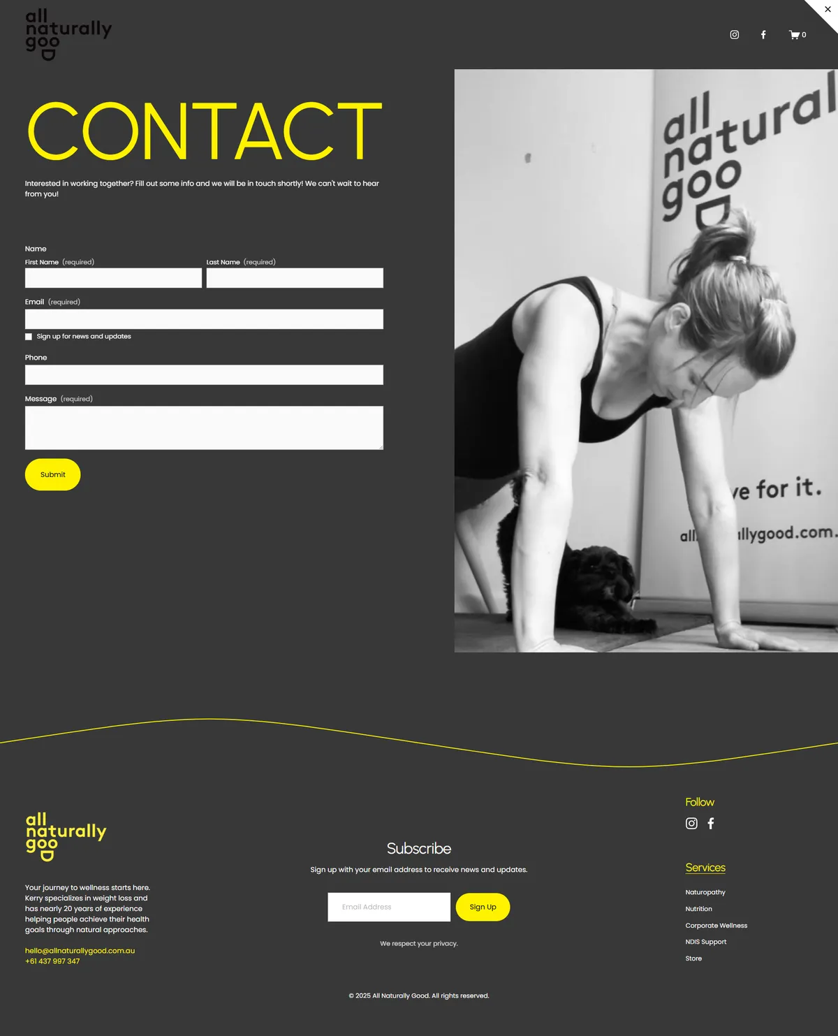
- Kept the signature yellow but used more sparingly
- Kerry liked an industrial/warehouse feel with stone greys
The Challenge
- Translating a values-led brand into a clear digital presence
- Avoiding clutter while still explaining products properly
- Making sure the site felt trustworthy in a health-focused space
- The Squarespace version in use was outdated, meaning the whole site needed updating
The Approach
- Ensuring Kerry's experience and credibility show
- Letting the products and brand values lead the design
- Kept it simple but personable
What We Delivered
Clean, responsive website
Clear content structure
Mobile-friendly layout
Shows Kerry's personality and brand, modernising the site
The Result
- A calm, confident online presence
- Easier customer navigation
- A site that feels aligned with the brand's philosophy
Tech Stack
Platform
Squarespace
Hosting
Squarespace
Design
Re-design
Right for:
- Health & wellness brands, like health food stores, natural products brands, or wellness retailers
- Product-based businesses
- Founders who want clarity, not complexity
Want a Website Like This?
I work with small businesses in Perth and across Australia. Let's have a quick chat about what you need. I'll give you a clear, fixed price — no pressure, no surprises, no jargon.